
Key Takeaways:
- Your shop front sign should be planned alongside your shop front installation, not added as an afterthought — integrated signage looks better and costs less.
- Fascia signs typically cost between £300 and £1,500 when installed as part of a new shop front, while illuminated lettering ranges from £500 to £3,000.
- Most commercial signs in England need advertisement consent from your local planning authority, with fines of up to £2,500 for non-compliant signage.
- The five main sign types for commercial premises are fascia signs, projecting signs, hanging signs, window vinyl, and illuminated lettering.
- Choosing materials that match your shop front system (aluminium, timber, or composite) creates a cleaner finish and extends the lifespan of both the signage and the frontage.
You have spent weeks choosing the right shop front for your business. The aluminium framework is sleek, the glazing is perfect, and the entrance looks welcoming. Then someone bolts a cheap plastic sign above the door, and the whole thing falls flat.
It happens more often than you might think. Signage is one of those details that business owners leave until the last minute, treating it as separate from the overall shop front design itself. But your sign is part of your frontage. It sits on or within the fascia panel, it needs wiring if you want illumination, and it has to work visually with the materials around it. Getting signage right starts with getting the shop front right.
This guide covers everything you need to know about choosing shop front signs for a commercial premises in the UK — from sign types and materials to lighting options, design principles, planning permission, and how professional installers integrate signage into the build from day one.
Types of Shop Front Signs
Before you start thinking about fonts and colours, you need to decide which type of sign (or combination of signs) suits your premises. Each option has different visibility characteristics, cost implications, and planning requirements.
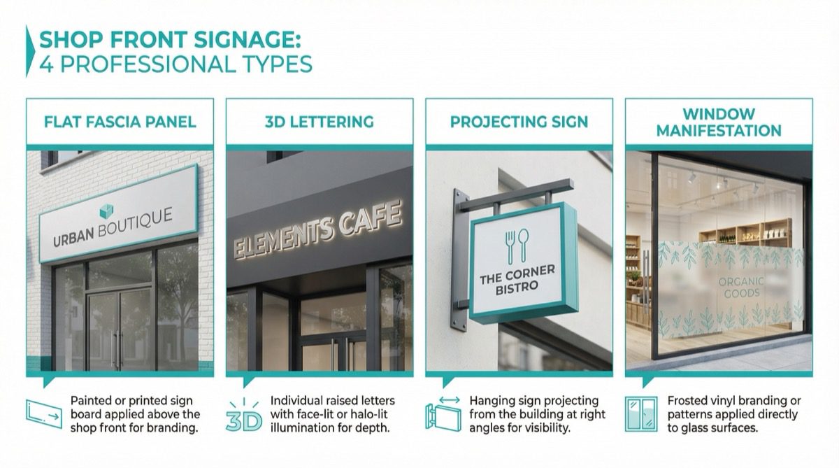
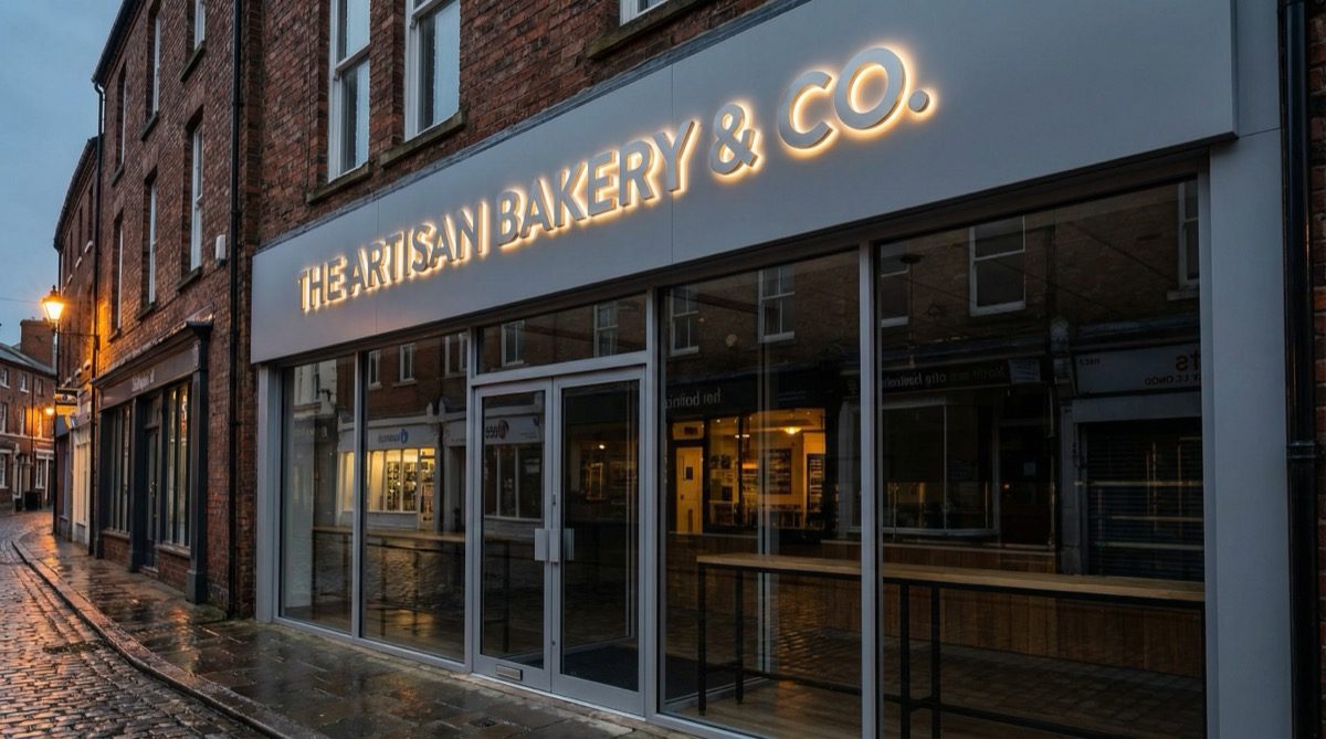
Fascia Signs
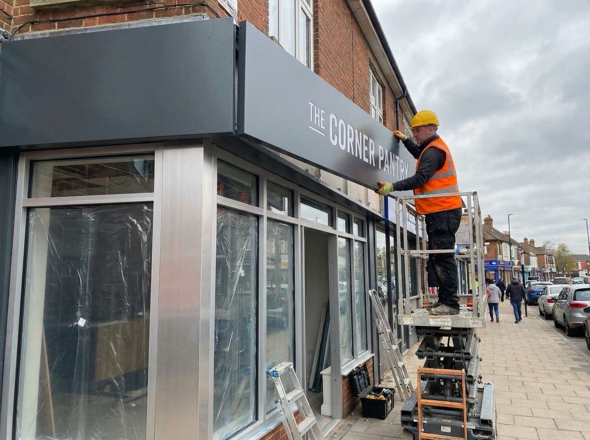
The fascia is the panel above your shop windows, bridging the gap between the glazing and the upper floors. It is prime real estate for signage and the most common choice for UK high street businesses. When your shop front is being designed, the fascia panel can be built to accommodate specific lettering dimensions, mounting points, and wiring channels.
There are several fascia sign formats to consider:
- Flat panel signs — vinyl lettering or printed graphics applied directly onto an aluminium composite panel. Clean, affordable, and easy to update if your branding changes.
- Built-up (3D) lettering — individual letters fabricated from metal or acrylic and mounted onto the fascia. These create depth and shadow, giving your frontage a more premium feel.
- Tray signs — a recessed box fitted into the fascia with internal illumination. Common among retail chains and pharmacies.
A standard fascia sign installed as part of a new aluminium shop front typically costs between £300 and £1,500, depending on the size, materials, and whether illumination is included. Bear in mind that steel fascia panels are prone to rust and corrosion over time, which can damage both the sign and the mounting surface — aluminium avoids this problem entirely.
Projecting and Hanging Signs
Fascia signs catch attention from across the road, but they are easy to miss if you are walking directly below them on the pavement. That is where projecting signs come in.
A projecting sign extends outward from the building at a right angle, catching the line of sight of pedestrians in both directions. Modern versions are typically an aluminium panel with your logo or business name, sometimes internally illuminated. They pair well with a fascia sign, giving you visibility from multiple angles.
One practical consideration: projecting signs need a sturdy mounting bracket fixed to something solid. When a shop front is being installed, the installer can position reinforcement or backing plates within the framework for this purpose. Retrofitting a projecting sign onto a finished fascia often means visible fixings and compromised weatherproofing.
Window Vinyl and Manifestation
Vinyl manifestation — frosted, printed, or cut vinyl applied to the glass — lets you display your business name, logo, opening hours, or promotional messaging directly on the glazing. Building regulations require manifestation on large glass panels to prevent people walking into them, so you can turn that compliance requirement into a branding opportunity.
Window vinyl is also one of the cheapest signage options. A full window graphic typically costs between £100 and £500, and it can be removed or updated without any structural work.
Illuminated Signage
If your business trades during evening hours, illuminated signage is essential. Even daytime-only businesses benefit during the darker months (roughly October through March in the UK).
The main options are:
- Halo-lit (back-lit) lettering — LEDs behind individual letters create a glow against the fascia. Sophisticated, high-end look.
- Front-lit lettering — LEDs illuminate the face of each letter. Bolder and more visible from a distance.
- Internally illuminated signs — light boxes or tray signs with translucent faces. Common for pharmacies and retail chains.
- External spotlights — gooseneck or trough lights mounted above the sign. A good retrofit option for signs not wired for internal lighting.
Illuminated lettering typically costs between £500 and £3,000. For a deeper look at lighting options, our guide to choosing shop front lighting covers the subject in detail. The key point: electrical wiring needs to be planned before the shop front is built, not chased into a finished fascia afterwards.
Materials: Matching Your Sign to Your Shop Front
Choosing signage materials independently of your shop front materials is a common mistake. A cheap PVC sign on a high-quality aluminium frame undermines the entire investment. Here is how the most common signage materials pair with different shop front systems:
- Aluminium composite panels (ACM) — the most versatile option. Lightweight, weather-resistant, and available in virtually any colour or finish. These work well with aluminium shop fronts and can be powder-coated to match the framework exactly.
- Acrylic — used for individual cut letters, light boxes, and translucent signage panels. Acrylic offers clean edges and works particularly well with LED illumination. It suits modern commercial frontages.
- Stainless steel or brushed metal — premium materials for built-up lettering. These pair well with contemporary aluminium and glass frontages and age gracefully in exposed conditions.
- Timber — hand-painted or carved timber signs are sometimes required in conservation areas and historic high streets. They complement timber shop fronts and add character, though they need more maintenance than metal or composite alternatives.
- Vinyl — for window graphics, cut lettering on glass, and temporary promotional signage. Low cost, highly versatile, and easily replaced.
When your shop front installer handles signage as part of the overall project, they source fascia panels, sign materials, and framework finishes from compatible suppliers. The result is consistent colour matching, proper weatherproofing, and a frontage that looks like one coherent design.
Design Principles That Actually Work
There is no shortage of advice online about sign design, most of it aimed at graphic designers rather than business owners. Here is what matters in practice.
Legibility Comes First
Your sign needs to be readable from at least 15 to 20 metres away on a typical high street. A few rules of thumb:
- Lettering should occupy no more than 75% of the fascia height. Leave breathing room above and below.
- Sans-serif fonts (Helvetica, Futura, Montserrat) are more legible at a distance than serif or script fonts.
- High contrast between lettering and background is non-negotiable. Avoid mid-tone combinations like grey on blue.
- Limit fascia signage to your business name and possibly a short descriptor. Phone numbers and opening hours belong on the door or window.
Colour and Branding Consistency
Your signage colours should match your wider brand identity — website, business cards, uniforms, packaging. If a customer has seen your Instagram page and then walks past your shop, the colours should be immediately familiar.
Colour also affects visibility and plays a direct role in attracting foot traffic. Warm colours (reds, oranges, yellows) advance visually, while cool colours (blues, greens) recede. A warm-coloured sign on a neutral background will pop. When working with a shop front installer, you can specify RAL colour codes for both the framework and fascia, ensuring exact matching across the entire frontage.
Keep It Simple
The most effective shop front signs share a common trait: they are clean, uncluttered, and confident. A strong business name in a well-chosen font, set against a solid colour, with nothing competing for attention. Contact details, social media handles, and opening hours can go on the door, window, or a separate panel below the fascia.
Planning Permission and Advertisement Consent
This is the part that catches many business owners off guard. In England and Wales, most commercial signs require advertisement consent from your local planning authority. This is separate from planning permission for the shop front itself, and it applies even if you are replacing an existing sign.
Under the Town and Country Planning (Control of Advertisements) (England) Regulations 2007, certain signs benefit from “deemed consent,” meaning you do not need to apply. However, deemed consent has conditions — for example, a projecting sign must not exceed 0.3 square metres, and illumination must meet specified standards. If your sign exceeds these thresholds, or your premises is in a conservation area, national park, or listed building, you will need to apply for express advertisement consent.
Conservation areas bring stricter controls. Internally illuminated box signs and plastic fascias are commonly prohibited, while hand-painted timber signs and individually mounted metal letters are usually preferred. For listed buildings, you may also need listed building consent, and fixings must avoid damage to historic fabric.
When you commission a complete shop front installation rather than buying signage separately, the installer can factor advertisement consent into the project timeline. At Huxley & Co, we coordinate with local planning departments on behalf of our clients, ensuring the signage specification meets local requirements before fabrication begins.
How Signage Integrates Into a Shop Front Installation
This is where the real value lies in thinking about signage as part of your shop front project rather than a separate purchase.
When signage is planned from the start, the fascia panel can be designed with pre-drilled mounting points for built-up lettering, concealed cable channels for LED illumination, specific panel depths for tray signs or light boxes, and colour-matched finishes across the entire frontage.
Electrical wiring is a good example. Illuminated signs need power routed from inside the building to the sign outside. During installation, cables can be threaded through the aluminium framework — completely hidden. Retrofitting wiring after the fact means surface-mounted cables, visible conduit, or drilling through the fascia. None of those look good, and all of them compromise weatherproofing.
The same applies to fixings. Every bracket and cable entry point is a potential weak spot for water ingress. When installed as part of the build, every penetration gets properly sealed. Standalone sign installers working on a finished frontage do not always have the same attention to the underlying structure.
Understanding the full cost of a shop front installation helps you budget for integrated signage from the outset.
Cost Guidance for Integrated Shop Front Signage
Here are typical price ranges when signage is installed as part of a shop front project:
| Sign Type | Typical Cost Range | Notes |
|---|---|---|
| Flat panel fascia sign (vinyl lettering on ACM) | £300 — £800 | Most affordable option; easy to update |
| Built-up (3D) metal lettering | £600 — £1,500 | Premium look; price depends on letter count and size |
| Illuminated lettering (halo-lit or front-lit) | £500 — £3,000 | Includes LED modules and wiring |
| Internally illuminated tray sign / light box | £800 — £2,500 | Common for chains and pharmacies |
| Projecting / hanging sign | £250 — £1,000 | Includes bracket and fixing |
| Window vinyl / manifestation | £100 — £500 | Per window; includes design and application |
These costs are typically lower when bundled with a full shop front installation, because fabrication, delivery, and labour are already happening. Ordering signage separately means a second design process, a second fabrication run, and a second site visit. For a complete picture, see our shop front cost guide.
Frequently Asked Questions
Do I need planning permission for a shop front sign?
Most commercial signs require advertisement consent from your local planning authority. Some small, non-illuminated signs benefit from “deemed consent,” but this depends on size, illumination, and whether the property is in a conservation area. Check with your council’s planning department before ordering signage.
What is the best type of sign for a shop front?
A fascia sign is the primary choice for most UK high street businesses because it sits in the natural line of sight for people across the street. Pairing it with a projecting sign gives visibility from multiple directions. The best combination depends on your building, location, and budget.
How much does a shop front sign cost?
A basic vinyl fascia sign starts from around £300, while illuminated built-up lettering can reach £3,000 or more. Costs are generally lower when signage is installed as part of a complete shop front project rather than fitted separately.
Can I install a sign on a listed building?
Yes, but you will need both advertisement consent and likely listed building consent. Expect strict restrictions on materials, fixings, and design. Hand-painted timber signs and individually pinned metal letters are typically acceptable; illuminated box signs and plastic panels usually are not.
What materials are best for outdoor shop signs?
Aluminium composite panel (ACM) is the most popular choice — lightweight, weather-resistant, and available in any colour. For individual letters, acrylic and stainless steel are durable and maintain their appearance for years. Matching your sign materials to your shop front system creates a more cohesive finish — something that matters whether you are fitting out a new restaurant or installing a hair salon shop front.
Should I choose illuminated or non-illuminated signage?
If your business operates in the evening, illuminated signage is strongly recommended. Even daytime-only businesses benefit during winter months when it gets dark by 4pm. Halo-lit LED lettering offers a sophisticated look with low running costs. See our shop front lighting guide for a full comparison.
How long does a shop front sign last?
A well-made fascia sign on ACM should last 10 to 15 years. Vinyl lettering may need refreshing every 5 to 7 years due to UV fading. LED modules typically last 50,000+ hours, roughly 10 to 12 years of daily use.
Can my shop front installer handle signage as well?
Yes. When signage is designed alongside the shop front, the fascia can be built with integrated mounting points, concealed wiring, and colour-matched finishes. This produces a cleaner result and usually costs less because the labour and access equipment are already on site.
Get Your Shop Front and Signage Right the First Time
Your sign is part of your shop front, not something bolted on afterwards. The fascia panel, mounting points, wiring, colour matching, and weatherproofing all work better when planned as one project. If your current frontage is showing its age, our guide on when to replace your shop front can help you decide whether it is time for a full upgrade with integrated signage.
At Huxley & Co, we have been designing and installing commercial shop fronts across London and the South East for over 20 years. We are FENSA registered, CHAS accredited, and Constructionline approved. Signage integration is a standard part of every project, from initial design through to final installation. Browse examples in our project gallery, or get in touch to discuss your requirements.
Call us on 020 7112 4849 or email info@huxleyandco.co.uk for a free consultation. You can also fill in our contact form and we will get back to you within 24 hours.